

For the ‘space generation’ the sky is not the limit
August 31, 2015
UrbanGeekz Secures Spot at Technology Innovation Hub
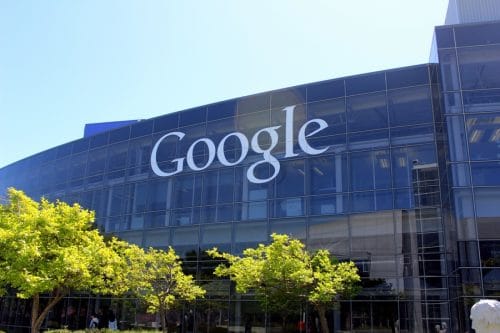
September 4, 2015Google Unveils Swanky New Logo
Google has unveiled a revamped logo for its core services.
The world-famous color combination remains the same but the makeover drops the “serif” style of the earlier incarnation.
The tech company says the new look is more suitable to engaging with the brand on mobile devices, which are increasingly becoming the preferred tool to access the Internet. The original logo was designed to be viewed on a desktop computer.
Google unveils new logo
Google believes the redesigned format and its variations will be better suited to different-sized screens that consumers are now using to interact with Google and its services. Along with the full logo of the company’s name, the image is now animated, with letters transforming into a series of four dots in its signature blue, red, yellow, and green colors.
A multi-colored capital “G” will also represent the brand.
This isn’t the first time that Google has changed its look. There have been a number of upgrades since the company launched in 1998.
Google announced the change on its official blog. It said the logo was “simple, uncluttered, colorful, friendly” and represented the best of Google. The design comes just weeks after a corporate reshuffle that saw Google move under a new holding company Alphabet.
Join the UrbanGeekz community for the latest in tech, innovation, entrepreneurship, culture, and opportunities. Subscribe here.


